
How to Create a Chart with Two X-Axes and Two Y-Axes in Excel
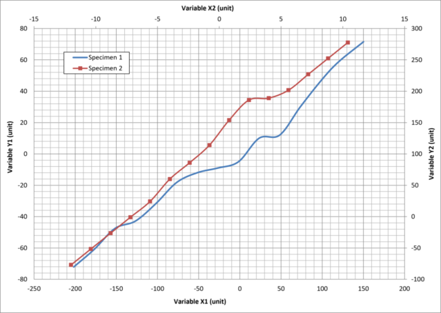
Excel is one of the most widely used tools for analyzing and presenting data, but charts with multiple axes are not always intuitive to build. Whether you’re working on a lab report, an engineering project, a transportation study, or a class assignment, putting multiple datasets on the same chart makes comparisons far easier.
This technique shows up well beyond the classroom. A physics student might plot displacement against time and speed on a second axis to see how position and velocity change together. An economics student might compare demand and revenue as price changes. Transportation engineers use dual-axis charts to examine how traffic volume and average speed vary across a day or along a corridor. Environmental scientists compare rainfall and stream flow to study how precipitation drives river response. In every case, the ability to display two related datasets on one chart is a skill worth having.
This guide explains two approaches:
- Creating one X-axis with two Y-axes
- Creating two independent X- and Y-axis pairs on a single chart
A downloadable Excel template with sample data and both completed examples is included at the end.
When Should You Use Multiple Axes?
Multiple axes are useful when two datasets are related but don’t share a common scale. Choosing the right layout makes results easier to read and communicate. Common examples include:
- Temperature and pressure during an experiment
- Traffic volume and average speed
- Demand and revenue in economics
- Displacement and velocity
- Any two measurements with different units or different X-values
Method 1: One X-Axis with Two Y-Axes
Use this method when both datasets share the same X-values but have different Y-values.
Example dataset:
| X | Y1 | Y2 |
|---|---|---|
| 1 | 25 | 120 |
| 2 | 32 | 150 |
| 3 | 41 | 195 |
Step 1: Create the Scatter Plot
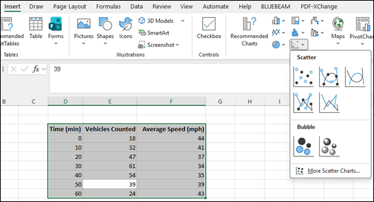
- Select the column headings and all data values.
- Go to Insert → Scatter.
- Choose the scatter chart style you prefer.
Both data series will appear on the same chart with a single Y-axis.
Step 2: Move One Series to a Secondary Y-Axis
- Select the series that should use the second Y-axis.
- Right-click the series and choose Format Data Series.
- Under Series Options, select Secondary Axis.
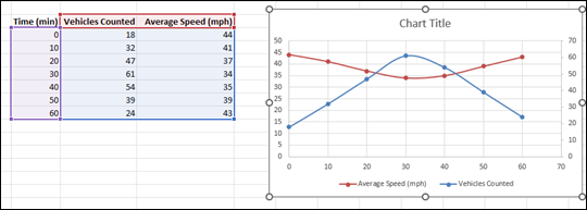
Excel will automatically place a second Y-axis on the right side of the chart.

Step 3: Label the Axes
Add descriptive titles to both Y-axes, including measurement units. The finished chart will have one shared X-axis, a left Y-axis, and a right Y-axis.
Method 2: Two X-Axes and Two Y-Axes
Use this method when each dataset has its own X-values. For example:
- Series 1 uses X₁ and Y₁
- Series 2 uses X₂ and Y₂
The column order does not matter as long as the correct X- and Y-ranges are assigned to each series.
Step 1: Create the First Scatter Plot
Create a scatter chart using only the X₁ and Y₁ data.
Step 2: Add the Second Data Series
- Right-click the chart and Select Data.
- Click Add.
- Set Series X Values to X₂ and Series Y Values to Y₂.
Both datasets will now appear on the same chart.
Step 3: Plot the Second Series on the Secondary Axis
- Select the second series.
- Open Format Data Series.
- Select Secondary Axis.
Step 4: Display the Second X-Axis
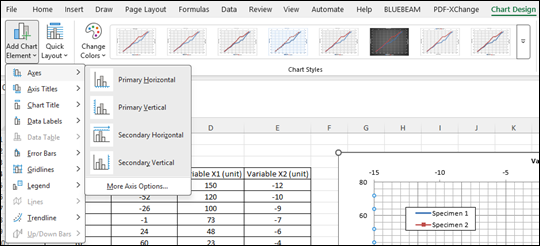
Go to: Chart Design → Add Chart Element → Axes → Secondary Horizontal. Excel will add a second horizontal axis at the top of the chart.
Step 5: Add Titles
Add labels to all four axes including the units used for each variable.
Common Mistakes
When creating charts with multiple axes, watch for these common issues:
- Assigning the wrong X-values to a data series
- Plotting the incorrect series on the secondary axis
- Forgetting to display the secondary horizontal axis
- Omitting axis titles or measurement units
- Choosing axis scales that exaggerate or minimize differences between datasets
Always double-check that each series is connected to the correct X-values before interpreting the results.
Tips for Creating Clear Charts
- Always include descriptive axis titles.
- Include measurement units for every axis.
- Use noticeably different markers or line styles for each dataset.
- Keep axis ranges reasonable and easy to interpret.
- Remember that secondary axes can improve readability, but poorly chosen scales may unintentionally exaggerate differences.
Download the Excel Template
The downloadable Excel workbook includes sample data and completed examples demonstrating both methods described above. Simply replace the sample values, update the series names and axis titles, and use the chart as a starting point for your own laboratory reports, engineering analyses, research projects, or classroom assignments.
Want Help Interpreting Your Data, Not Just Charting It?
Building the chart is only half the work. Reading the trends, explaining what the two axes actually show, and using that to answer the assignment question are the harder skills.
At CorePath Tutor, I help middle school, high school, and college students build strong foundations in math, statistics, and quantitative reasoning through personalized one-on-one tutoring. Whether you’re preparing for an exam, completing a lab report, or strengthening your understanding of core concepts, the goal is long-term confidence and independent problem solving.
Learn more about tutoring services or schedule a consultation to discuss your academic goals.
